Visual Options
The accent colour the whole theme is built on.
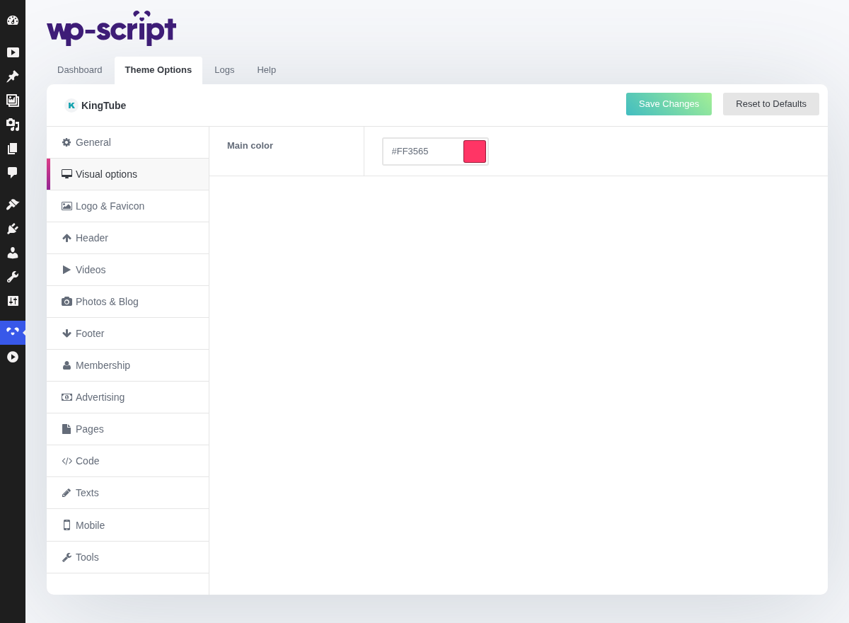
1. Main Color

2. Picking one that works
The colour is used for links, buttons, the active menu item and the hover states. Two things follow:
- It has to read against the theme's background. A colour that looks right in a picker can be invisible in place. Check it in the preview rather than in your head.
- It is the only accent. There is no second colour to fall back on, so it has to carry both "this is a link" and "this is the main action" on its own.
If you have a logo, take the colour from it. A tube whose accent matches its logo looks deliberate at no extra cost.