Colors
KolorTube is built around a single accent colour, which is where its name comes from. One setting drives it across the whole theme.
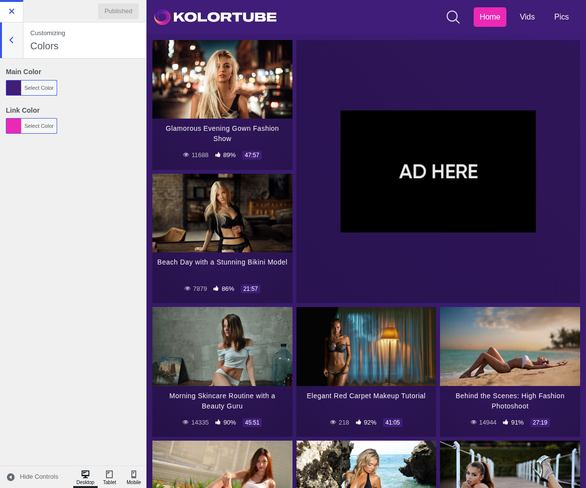
1. Main Color

2. Link Color

3. Picking one that works
The colour is used for links, buttons, badges, the active menu item and the hover states, all of it on the theme's dark background. Two things follow from that:
- A dark accent disappears. Navy or deep brown on a dark purple background leaves your buttons barely visible. The colour has to be lighter than the background, not just different from it.
- It is the only accent. There is no second colour to fall back on, so whatever you pick has to carry both "this is a link" and "this is the main action" without help.
If you have a logo, take the colour from it. A tube whose accent matches its logo looks deliberate at no extra cost.