Appearance
The accent colour, the shape of the corners, and how solid the bottom bar is.
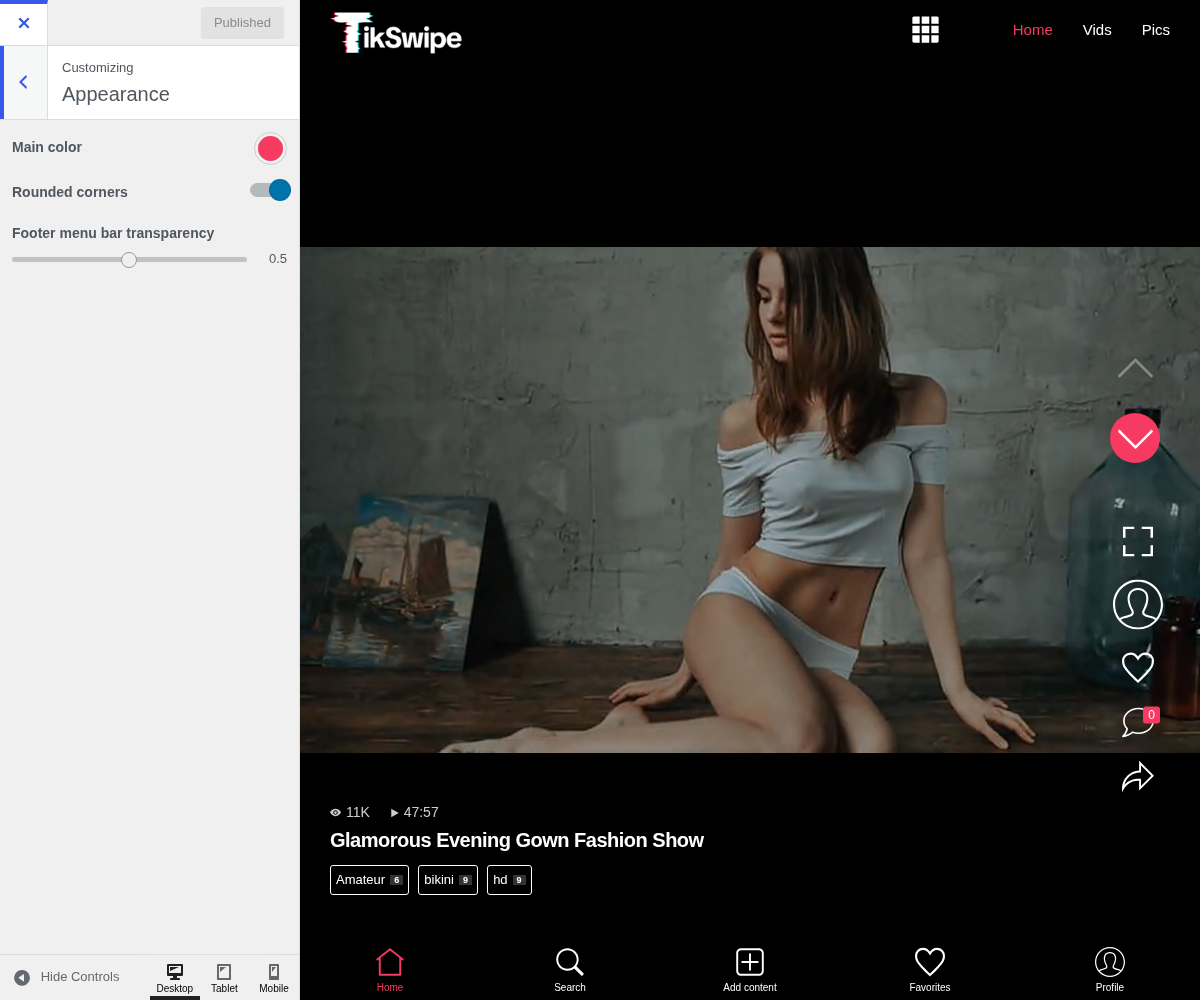
1. Main Color

Used for the active items in the bottom bar, the buttons and the highlights, all of it over video. Two things follow:
- It has to survive being drawn on anything. Unlike a grid theme with a fixed background, your accent sits over whatever frame is playing. A colour that reads well on black can vanish over a bright clip.
- Saturated wins. Muted colours that look tasteful on a white page disappear here.
2. Rounded Corners

Softens the edges of the cards and buttons. Small, but together with Footer menu bar transparency below it decides how much the interface intrudes on the video.
3. Footer Menu Bar Transparency

Decides how much of the video shows through the bottom bar. A more transparent bar gives the video the whole screen and makes the icons harder to read over a busy frame. It is worth checking yours over a bright video rather than the dark one that happens to be first in the feed.